CompTIA Virtual Workbench Labs UX/UI
Activities & Roles:
Cross-functional Project Management
UX Research and Usability Testing
UX Design and UI Design
Programs Used:
Adobe XD
Figma
Team:
Myself (Design)
Engineering Vendor
Product Team
Overview
CompTIA is an IT certifications and training organization. While most hands-on training takes place in classrooms with real computer hardware, the COVID-19 pandemic forced us to develop a way for students to perform hands-on tasks in a virtual environment.
The outcome was a simulated hardware lab that allowed students interact with components, build computers in a 3D virtual environment, and be assessed on their work. I was the only designer used in this cross-functional, vendor-assisted project.
The Problem Space
Despite the complexity of building a game-like 3D environment, an upcoming major product launch meant we only had four months to design, develop, test, and launch the labs. To start unraveling the complexity, I broke the project down into sub-projects as follows:
How to smoothly transition users from he parent/host eLearning platform into the labs platform
How to design the interface aesthetics and usability
How to teach users how to control the lab
Issue 1: Transition Users from eLearning into Labs
Labs would have to be integrated into our eLearning platform. Our engineering vendor would work with our platform vendor to ensure technical functionality, but I had to ensure users avoided the confusion of transitioning interfaces.
Due to significant technical and integration constraints, there was only one immediate solution - using a modal built by our platform vendor. Using this modal would alert a user to the state change and launch the lab in a separate window. While not a perfect transition, this served as an extremely low-cost solution to an otherwise potentially huge issue.
eLearning-to-Labs Flow: The eLearning interface shows a list of learning tasks at the bottom and a primary “Get Started” action button at the top right. Clicking either will show a modal before launching the lab. This modal alerts the user to the context change and then launches the lab in a separate window while maintaining the eLearning platform in its own window in the background.
Issue 2: Design the Interface Aesthetics and Usability
While our engineering vendor did have a style template, it wasn’t appropriate for our design system, feature needs, or usability needs. It was determined we’d need an overhaul of the UI and aesthetic without an overhaul of the underlying functionality.
Based on CompTIA requirements, I designed an initial mock of the interface that cut out unneeded interactions, changed and moved other interactions, and updated the visual style to align to our product style guides. I would then take this interface into usability testing. This initial mock has the following updated features:
Updated UI and color scheme based on CompTIA product design system
Simpler menu with less nesting
Step-based instructions with new sub-steps feature
Updated global UI menu with clearer actions, icons, and descriptions
Vendor Demo Interface: This initial interface provided by the vendor features an entry and lesson selection screen (left), a mode or difficulty selector (middle), and the lab activity itself with instructions (right).
v1 Interface: I designed this updated interface based on organization needs, updating aesthetics and functionality and decreasing the complexity to move directly into the lab. This cuts down on an extra selection screen/step.
Issue 3: Teach Users how to Control the Labs
CompTIA has an extremely varied user base, from 16-year-olds considering IT to 70-year-olds maintaining skills. All users needed a way to interact with a content type (3D) they may have never used before. We needed to make the environment as accessible as possible, so I decided on supporting four control methods, not all of which would be available at launch:
Mouse or Touchpad + Keyboard
Mouse or Touchpad Only
Keyboard Only
Touch
Determining v1 Controls
I wanted to take a best guess approach at controls first, and then bring those controls into testing to refine. I designed initial controls based on the following examples:
Game Design (e.g. Dyson Sphere Program, Cities: Skylines)
Depth-based Mobile Apps (e.g. Google Maps)
Interaction Guidelines (e.g. Apple Human Interface Guidelines)
The result was an initial, albeit complex showcase of all the controls a user may need. I’d use this as the basis for usability testing.
v1 Controls: A first attempt at displaying controls within the lab.
Usability Testing and Peripherals Survey
I wanted to build an interface as fast as possible so that I could get a prototype in front of users to test. I performed six usability studies, each with a variety of open-ended scenarios and questions to understand how the interface and, especially, the controls were used and perceived.
During this time I also realized that I had no true data or understanding on how users physically interacted with our content. I wasn’t sure how to order or introduce the controls because I had no data on what devices or peripherals our users had. So, I asked our research team to run survey of customers to determine peripheral, device, and assistive technology usage. I’d use this to prioritize menus, accessibility considerations, and especially controls.
Usability Testing: This is a portion of the document I used to test users on various actions within the v1 interface.
Making Changes Based on Research
Though usability testing and research led to many tweaks and updates, the overall changes can be categorized into three major areas:
Change 1: Updating the UI Footer
Users were confused at the placement and usage of many icons. We went back and forth with them to refine a new set of icons, labels, and placements to make a more understandable interface. For example, in the original design, users correctly identified the compass icon on the right side of the UI, but they didn’t understand it’s meaning for resetting the lab view. Though the idea was pulled from video game map design, that pattern just didn’t work here, so I scrapped it and made the icon more explicit.
Original (top) vs Updated (bottom) UI Footer: Based on usability testing, we updated the layout, labels, and icons for many functions. Follow-up sessions with users showed greatly-increased clarity and understanding.
Change 2: Streamlining the Controls
The next big change is an example of reducing complexity into more focused, consumable experiences. Usability testing showed it took significant time and effort to consume the controls, often due to being shown all controls for all peripherals. Users just needed their controls for their peripherals.
After multiple iterations and feedback, I landed on an accordion interaction with a default or suggested control method shown. The ordering and default display was based on the peripherals survey.
After testing again, users spent only one-third of the time on this screen vs the original display.
Updated Controls Interface v1 (left), v2 (middle), and Final (right): Following usability testing and peripheral usage research, the controls menu was iteratively improved to reduce complexity and provide a more focused, prioritized method of consuming controls.
Change 3: Creating an “Active” Tutorial
Usability testing showed that users just weren’t familiar with 3D controls. They needed a low-stakes, active way of playing with them (as opposed to a textual or video explanation). I pitched an “active” tutorial using the same environment we’d already built so that we could keep the time costs low. This would get users familiar with controls early on and, even more importantly, scaffold knowledge to them on how the interface and steps work.
This is a key idea: Instead of passively presenting information, we want to design a simple tutorial to gradually perform 3D movements in increasingly complex ways. In instructional design, we call this “scaffolding” knowledge.
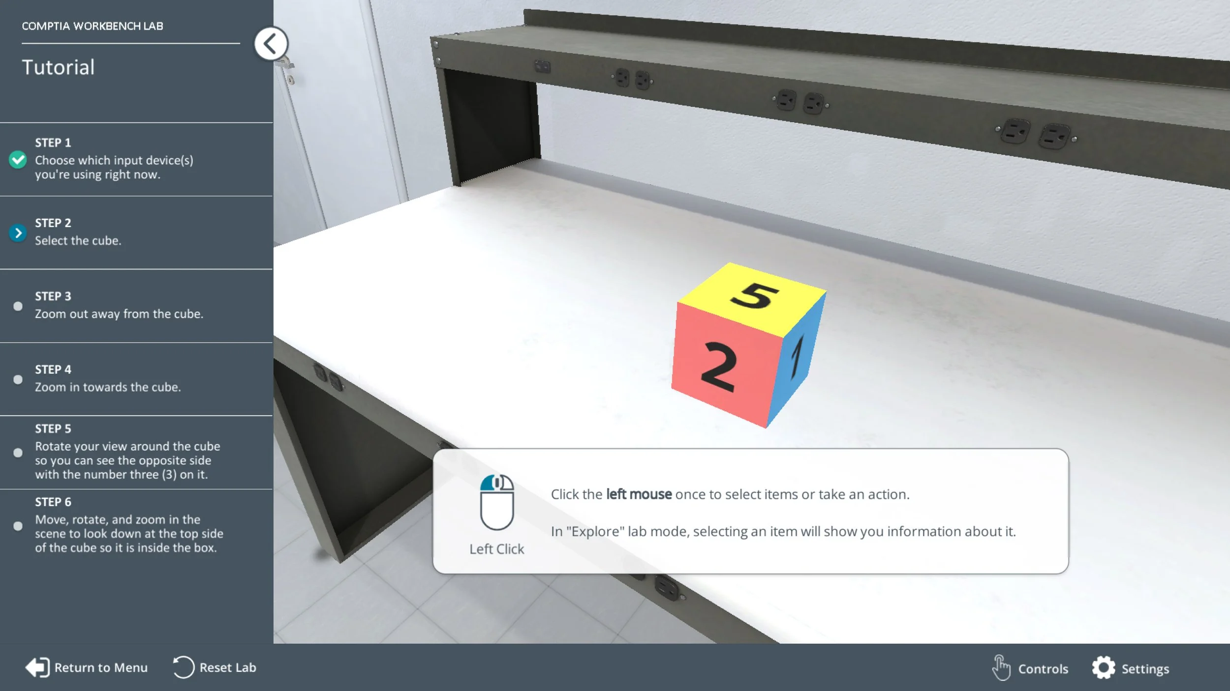
Tutorial Walkthrough Video - This shows an early version of the tutorial, following a basic 5-step onboarding process with each step building knowledge of how to use 3D controls. The final step requires a user to use all the controls.
Outcomes
Labs were completed and successfully launched within four months, on time. From scratch, I designed and collaborated with engineers and product managers to complete a new interface and design system for it, UX, controls, and flows. I also performed usability testing which resulted in improvements before release.
Labs are now being used in thousands of classrooms around the world.

Virtual Workbench Labs Overview Video: This shows some of the features of a workbench lab, including “explore mode” that shows components and definitions and “assisted mode” that functions as a walk-through of assembly steps.