
CompTIA Virtual Workbench Labs UX/UI
Activities & Roles:
Cross-functional Project Management
UX Research and Usability Testing
UX Design and UI Design
Programs Used:
Adobe XD
Figma
Team:
Myself (Design)
Engineering Vendor
Product Team
Overview
CompTIA is a leading IT certification and training organization that develops cutting edge training experiences. Traditionally, many such training experiences, like building a computer, happened in classrooms using real hardware. However, the COVID-19 pandemic required a new approach: bringing a physical hardware lab into a simulated environment, allowing students to interact with components, assemble hardware in a 3D virtual environment, and be assessed on their work. I was the sole designer on this cross-functional, vendor-assisted project.
The Problem Space
Despite the complexity of creating a game-like 3D environment and a tight timeline driven by an imminent product launch, we would need to design, develop, test, and release the labs from scratch using a small team with vendor support. To manage that complexity, I divided the project into three focused sub-projects:
Seamless transition from the parent/host eLearning platform into the 3D hardware lab experience
Interface aesthetics and usability design
User instruction for controlling the lab
Issue 1: Transition Users from eLearning to the Lab Experience
Labs needed to be integrated into our eLearning platform. Our engineering vendor coordinated with the platform vendor to make the integration technically possible, but I had to prevent users from becoming confused during interface transition..
Given the technical and integration constraints, the only viable solution was a modal provided by the platform vendor. The modal informs users about the upcoming change in state and then opens the lab in a separate window. It isn’t a seamless transition, but it offered a very low-cost, effective way to avoid a potentially large usability problem.
eLearning-to-Labs Flow: The eLearning interface shows a list of learning tasks at the bottom and a primary “Get Started” action button at the top right. Clicking either will show a modal before launching the lab. This modal alerts the user to the context change and then launches the lab in a separate window while maintaining the eLearning platform in its own window in the background.
Issue 2: Design the Interface Aesthetics and Usability
Our engineering vendor’s style template didn’t fit our design system, feature requirements, or usability goals. We needed a UI and aesthetic overhaul to meet our design system requirements without changing underlying functionality.
I created an initial interface mock that removed unnecessary interactions, reorganized and consolidated others, and refreshed the visual language to match our product style guides. I planned to validate this design in usability testing.
Key updates in the mock:
Updated UI and color palette aligned to product design system
Simplified menu with reduced nesting for faster navigation
Step-based instructions with a new sub-step capability for clearer task flow
Global UI menu rebuilt with clearer actions, consistent icons, and descriptive labels
Vendor Demo Interface: This initial interface provided by the vendor features an entry and lesson selection screen (left), a mode or difficulty selector (middle), and the lab activity itself with instructions (right).
Redesigned Interface: I redesigned the interface to match organizational needs, improving aesthetics and functionality while simplifying workflow. By removing an unnecessary selection step, users can move directly into the lab, reducing complexity and saving time.
Issue 3: Teach Users how to Control the Labs
CompTIA’s users span a wide range — from 16-year-olds exploring IT to 60-year-olds refreshing skills. Many would be encountering 3D content for the first time, so the experience had to be approachable for everyone. To maximize accessibility, I chose to support four control methods (with some rolling out after launch):
Mouse or Touchpad + Keyboard
Mouse or Touchpad Only
Keyboard Only
Touch
Controls and interactions for the 3D interface were developed based on best practices in multi-touch mobile apps (e.g. Google Maps) and popular video games, (e.g. Dyson Sphere Program, Cities: Skylines). The result was an initial, albeit complex showcase of all the controls a user may need. I’d use this as the basis for usability testing.
Prototype Controls Info UI: A first attempt at displaying controls within the lab.
Usability Testing and Peripherals Survey
I built a working interface quickly so I could test a prototype with real users. The initial usability test involved a handful of users navigating a prototype and a handful of open-ended scenarios and questions to learn how they used and perceived the interface and controls.
Further, I worked with our research team to run a survey with customers to understand how they interact with our content and how they use peripherals (e.g. computer mouse), physical devices, and assistive technologies. I used these results to prioritize menus, accessibility decisions, and the design and placement of controls.
Usability Testing: A small section of the usability testing document with initial questions used to test the interface and various user actions.
Changing Based on Research
Though usability testing and research led to many tweaks and updates, the overall changes can be categorized into three major areas:
Change 1: Updating the UI Footer
Users were confused by several icon placements and meanings. We iterated with them to create a clearer set of icons, labels, and placements that improved overall comprehension.
For example, users recognized a compass icon on the right side of the UI but didn’t understand it’s function (to reset the lab view). Despite being inspired by UI patterns in video game maps, the patterned failed in this context, so I replaced it with a more explicit icon that clearly communicates the reset action.
Original (top) vs Updated (bottom) UI Footer: Based on usability testing, we updated the layout, labels, and icons for many functions. Follow-up sessions with users showed greatly-increased clarity and understanding.
Change 2: Streamlining the Controls
The next major improvement simplified complexity into focused, easy-to-consume experiences. Usability testing revealed that users spent excessive time navigating controls because the interface showed every all controls for all peripherals with only their unique peripheral setup mattered.
After several iterations and user feedback, I implemented an accordion interaction that displays a default or suggested control method up front. The ordering and default choice are driven by the peripherals survey.
In follow-up testing, users completed tasks on this screen in one-third the time compared with the original design.
Updated Controls Interface v1 (left), v2 (middle), and Final (right): Following usability testing and peripheral usage research, the controls menu was iteratively improved to reduce complexity and provide a more focused, prioritized method of consuming controls.
Change 3: Creating an “Active” Tutorial
Usability testing revealed that users were unfamiliar with the 3D controls and needed a low-risk, hands-on way to explore them, not another text or video explanation. I proposed an interactive tutorial using the existing environment to keep development time down. This approach introduces controls early, then scaffolded users’ understanding by guiding them through progressively more complex 3D movements.
Rather than passively presenting information, the tutorial let users learn by doing, building confidence and fluency step by step.
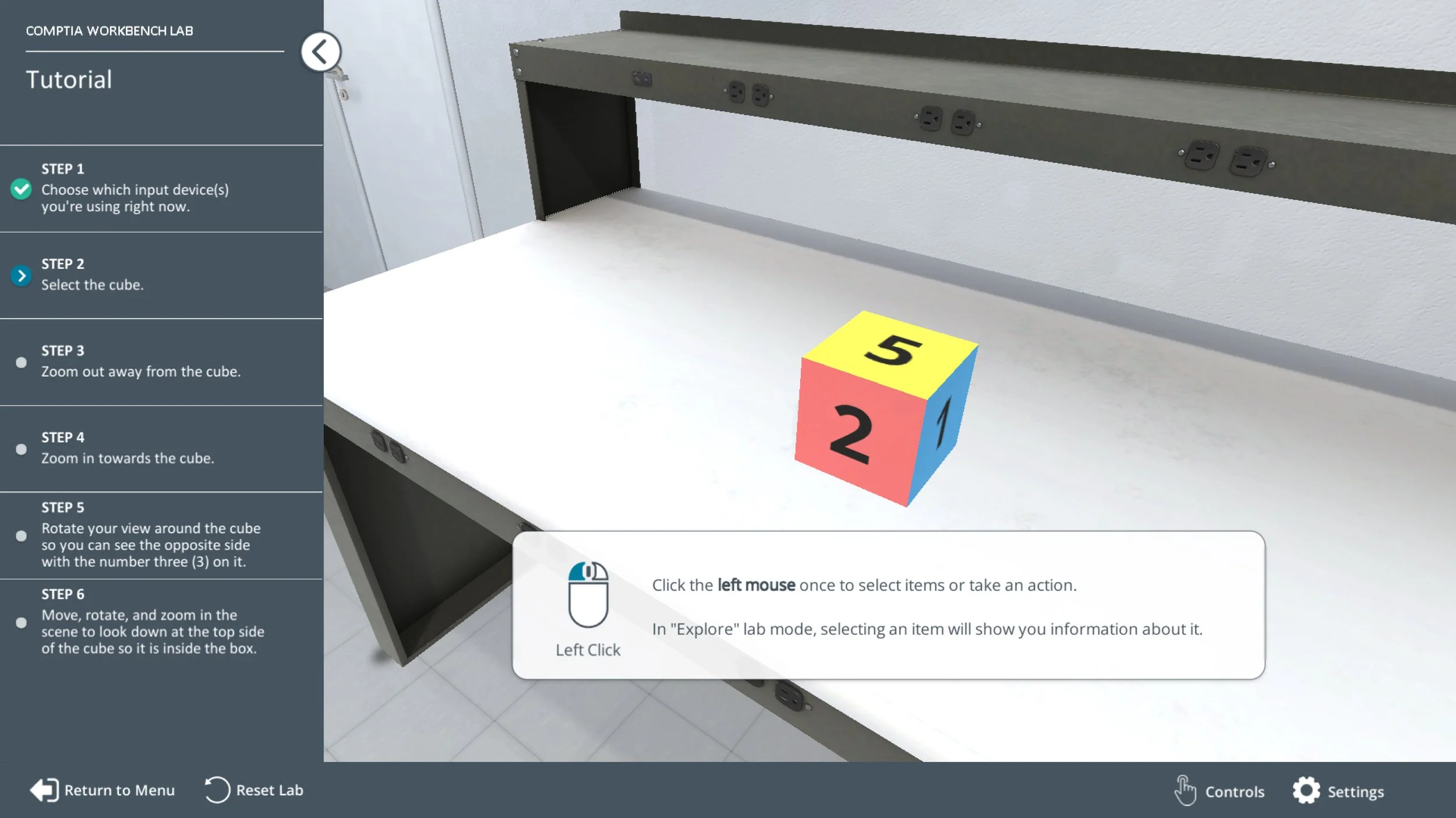
Tutorial Walkthrough Video: This is an early tutorial that follows a straightforward 5-step onboarding sequence. Each step introduces and builds mastery of the 3D controls, culminating in a final task that requires using every control together.
Outcomes
Labs launched on schedule — completed in their entirety within a few months. I led the end-to-end design from scratch, collaborating closely with engineers and product managers inside and outside the organization to create a new interface, design system, UX, controls, and interaction flows. I also ran usability tests that produced actionable improvements implemented before release. Today, Labs are used in thousands of classrooms worldwide across millions of sessions.
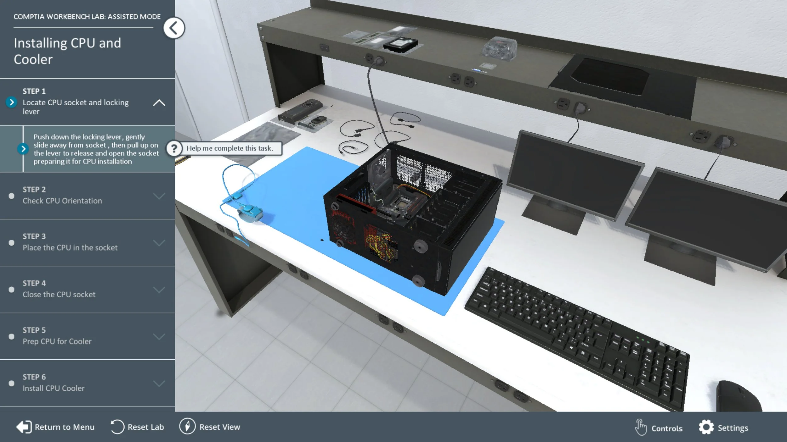
Virtual Workbench Labs Overview Video: This highlights key features of a workbench lab: an “Explore” mode that reveals components and definitions, and an “Assisted” mode that guides you step‑by‑step through assembly.